Are your customers quitting the buying process during the last phase of checkout? You probably have to improve the checkout process with the help of an ecommerce website design Sydney agency.
Consider that you are purchasing items from an online grocery shop, and once you go to pay for the items, you are required to fill in all the details and go through various pages to complete the payment. The payment page is also slow. What are your options? You will be annoyed and pick another shop. Your customers are doing the same.
A seamless checkout process not only enhances the experience of the customers but also positively impacts the business turnaround. In this post, we will cover the important principles that every business should consider for successful eCommerce checkout.
Understanding the eCommerce Checkout Process
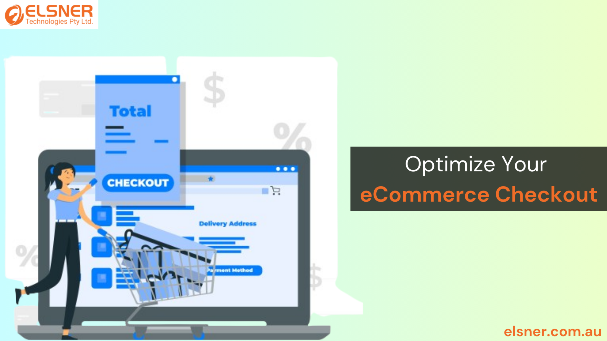
The eCommerce checkout process sits as the final bottleneck customers have to cross in order to complete the transaction. The major components of the checkout phase include:
- the cart review page,
- shipping information page,
- payment selection and processing page, and
- order summary page.
Despite its simplicity, this process contains some sticky points that, if not attended to during the ecommerce web design process, may cause cart abandonment.
There are a few reasons why customers may cancel an order while checking out:
- Complex or long address forms where customers have to type in everything.
- Lack of a buyer’s choice of payment methods
- Unexplained or obscure additional charges such as delivery cost, exchange rate cost, tax, or others
- A poorly mobile- optimized and slow payment page
So when you hire an ecommerce web design Melbourne agency for your store optimisation, ensure that these challenges are eliminated.
Here are some statistics on the percentage of cart abandonment:
Considering a number of studies done on different aspects of e-commerce, the average shopping cart abandonment rate across studies is 68.81%, while the most current one is 74.52%.
Based on a number of different e-commerce studies and internal statistics, abnormal or higher than normal cart abandonment rate could be due to a number of factors, some of which are bad checkout processes, shipping costs, sign-in requirements or limited methods of payment available
Key Elements Of A Smooth Checkout Experience
User-Friendly Design
A relatively simple, designed eCommerce checkout makes the customer experience less cumbersome and faster. Some of the key components that your hired ecommerce website design Sydney developers should focus on include engaging and vital CTAs and an easy-to-navigate screen.
Guest Account Options
Encouraging customers to create an account may enhance business in some ways, but making account registration mandatory might repel potential customers. By providing a guest checkout, customers are allowed to make purchases with little to no hindrances. During ecommerce website design Australia, you can just use the customer’s email ID to enable guest checkout.
Simplified Checkout Forms
Address or sign-in forms that are invariably long and tiresome can force the most dedicated of customers to abandon the process. Modifying the checkout forms by shortening the number of boxes and incorporating the usage of auto-fill can vastly improve the user experience.
Payment Methods and Security
Provision for Various Payment Options
Shopify and Magento development experts suggest that more than one payment type and mode must be incorporated in order to suit different customer requirements.
Include various payment methods such as credit and debit cards, PayPal, and digital wallets. This increases the chances that a store visitor will go through with making a purchase.
Privacy and Trust Indicators
It is important to establish trust, especially when it comes to conversion. Integrating SSL certifications, reputed payment gateways and portraying trust signals can make your customers feel confident that their payments and transactions will be secure.
A study conducted by Baymard Institute found that during checkout, 19% of potential buyers cancelled the payment because they felt their credit card information wasn’t processed securely.
So, during ecommerce web design Melbourne, don’t forget to add these elements to the checkout page.
Mobile Optimisation
When the proportion of consumers utilising mobile devices to shop is on the increase, providing the customers with a mobile version of your checkout process is critical. Here is what you can do:
Mobile-responsive design
A responsive ecommerce web design that adapts to different screen sizes, along with mobile-specific features like simplified navigation and mobile payment solutions, can dramatically improve the mobile shopping experience.
Mobile Payment Solutions
Payment options like Apple Pay or Google Wallet can be quite useful in minimising the hindrances faced by mobile users in the payment process. Consequently, this optimisation of ecommerce website design Australia increases mobile conversions.
Enhancing Post-Checkout Experience
Order Confirmation, Thank You Pages
Upon purchase, getting an order confirmation along with a thank you message makes customers happier, thus improving their experience at the highest point. It is also wise to include in the order confirmation tracking information, delivery dates, and order summary.
Communication and Updates
Sending emails for the confirmation of orders and order updates through SMS and notifications make the customers feel secure. This level of transparency can help generate trust and make customers repeat purchases. So consider these elements when discussing plans for ecommerce web design Melbourne.
Post Purchase Customer Support and Follow-up
Provide support after a customer has placed their order to build customer loyalty. Including more than one channel for providing assistance helps customers fix any kind of problem quickly.
Case Studies And Examples
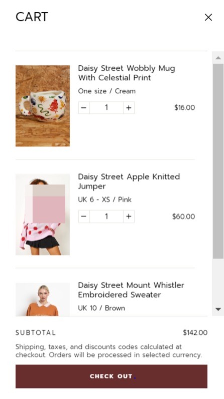
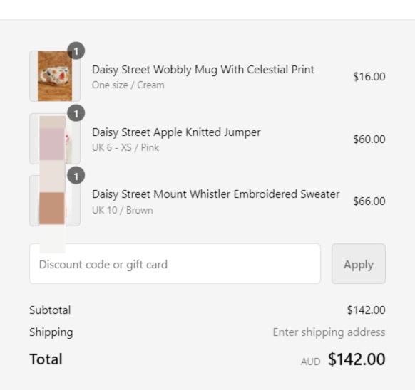
Daisy Street
‘Daisy Street’ is an online clothing shop that sells trendy online fashion. Below are the ways in which Elsner Magento development experts created the checkout page of their online store in order to minimise abandoned carts:
- Quick log-in for existing users and guest users
- Express checkout options
- Multiple payment options
- Option to save details for subsequent faster and seamless checkout
- Clearly mentioning shipping and additional costs.


Zense
Zense is a modern lifestyle and aromatherapy store. With a niche target audience, this store needed a comprehensive makeover. Here’s how Shopify development experts optimised the checkout experience:
- Quick cart view with clear mention of additional shipping charges and taxes.
- Detailed price breakdown
- Quick view of accepted payments and trust badge
- Multiple payment methods
- Auto-fill options in address form for smooth UX
- Quick links to important store policies giving absolute transparency
Emerging Trends For Ecommerce Website Design Australia
Checkout Optimisation with AI and Machine Learning
AI is capable of understanding user patterns. They can provide personalised checkout options, reducing cart abandonment rates.
Voice-Activated Checkouts
With the increasing popularity of smart speakers, voice-activated checkouts are becoming more feasible. Customers can give simple voice commands to complete the purchase process. This offers a hands-free and efficient way to complete purchases.
One-Click Purchasing and Biometric Payments ‘
One-click and biometric payment systems that use fingerprints or facial recognition give an additional security level, improving user experience at the same time.
Conclusion
Optimising your eCommerce checkout process is not just about reducing cart abandonment. With changing user expectations and innovations in digital technology, ecommerce is evolving rapidly. Staying ahead with these strategies is key to maintaining a competitive edge. Hire an ecommerce website design agency today to help you upgrade your store with these latest strategies.


